|
I am currently gearing up for a grad school interview and visit so please excuse my tardiness in posting this article. While getting ready for my visit I have been editing my physical portfolio as well as reading literature about how to present myself to a future employer or graduate program. Each article or advice column contradicts the next and each has something different to say about the formatting of a "good" portfolio. Despite all the garbely-gook I have decided one thing to be true and am trying to allow it to focus my efforts. Let the work reflect you as an artist and professional. No matter what others say about the size, color, order, or materials of your portfolio; you have to be comfortable putting it in front of others and saying "This is me!" I have rearranged my physical portfolio three or four times in preparation for this interview and it may be arranged once more before I hop on my plane. Despite my fussing with it, the contents are me and I am happy showing it to perspective professors or employers and saying "This is me!" (A word of caution, make sure you know the portfolio requirements of the program or company you are applying for. Some places have different requirements) If that's all you needed to hear about portfolios you can stop reading now, but if you really want a little bit more below are my opinions I believe work for me. They help my portfolio showcase me and my work. Now, I have accepted some of the standard guidelines of portfolio construction. For example I subscribe to the camp that believes a nice plain, black, bound book allows for your work to shine through. There are no distractions that will subtract from the work. I also have a straight forward resume; in other words it's black simple font on white simple paper. Maybe once I have become a little more settled into my professional career I will opt for a fancier template setting or font and graphics combo. For now a straight forward explanation of my skills is all I need. I enjoy creating and color, but that can be shown through the examples of my designs and projects. There is no need for glitter and modge-podge on the cover of my portfolio. (I'm not a big fan of glitter anyway) I formulated three guidelines to follow while reading up on the new trends and requirements for portfolios. They are: 1. Keep it neat. Neat as in clean. A nicely tacked down page with clean lines and a clear cover allow your interviewer to see your work and not guess which part is what. The last thing you want is for them to not see your favorite piece because it is poorly presented. 2. Edit. Do not put all of your work in your portfolio. The interviewers are not your mother; they do not want to see everything you have made since kindergarten. Select pieces that show your growth since entering the field you study. Remember the portfolio is saying "This is me!" Keep your pages to a lower two digit number as well. Mine is ten pages back and front (so effectively 20). If you leave something out and the interviewer wishes to see it, offer to email the piece once you return home. (With today's carry on luggage fees, you want a portfolio that is portable.) 3. Label. In a perfect world you will be in front of your interviewers explaining your work, but sometimes the world is not perfect. Also, those labels can sometimes act as markers for your brain. They give you something to go off of like those note cards we all used to use in grade school for the daunting task of class presentations. Labels can be little flags along the side of the road to remind you which direction you are going and which direction you want to head in.
0 Comments
For the past few months I have been brushing up on my rendering skills; drawing, shading, proportions, etc. It's important to keep these skills fresh and flexible. Renderings are a very important way for designers to translate their brain's jumble into stories that others can understand. But, what if drawing a design is not the best way to get across your design? What other options are there to give an understandable preview to a client? CollageCollage is one of the alternate ways to display designs I was taught at university. The concept is the same as the gluestick and magazine creations from kindergarten. The only difference is the intent. There are three different styles of collaging that I have experienced in my education. They are: 1. Found Object Collage: objects that are easily attached to paper are arranged to create the look and feel of a costumer's design. Items can include: silk flowers, ribbon, cloth, string, plastic, cellophane, etc. This style of collage allows for a more textured and three dimensional design. ~~~I saw an example of this object/fabric collage while in LA last year. There was a small exhibit on the costuming of the claymation Paranorman. The designer took pieces of cloth and stitched in shading and highlighting to give an idea how the clothing would look once on the clay characters. I really enjoyed the design and understood well what the designer envisioned. 2. Magazine Collage: pictures of clothing and people are cut from magazines and arranged how the designer envisions a character would style themselves. This style works well for bought or pulled shows. 3. Hybrid Collage: combines the best of both worlds. pictures other than clothing are pulled to create a wardrobe. Many times shading and highlighting of garments is cut from large pictures into specific shapes to give the illusion of depth. Collages are fun and can sometimes be a better way to get a design across depending on the style of play and direction the design team and director wish to take the show. PhotographyThis way of expressing a design is most useful if the design is pulled from stock. Costume pieces are placed on mannequins as an ensemble and photographed for the design team's use. I have not seen this way used often because it is labour intensive, but if the cast is small and the stock is well known to the designer, it may prove to be a better option if the director wants to see the exact garment that will be onstage.
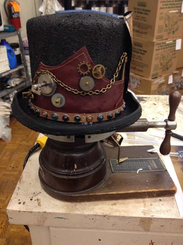
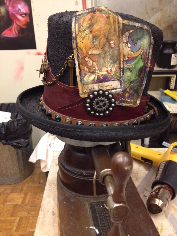
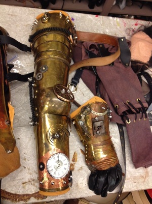
After returning from tour this winter I busied myself with costume crafts for Nebraska Theatre Caravan's steampunk tour of Fantasticks! It was quite a quick education of the culture of steampunk, but I loved creating pieces that one may see in a futuristic past. I had heard of steampunk before but I wasn't quite sure how the name came to be. I was watching Oddities: San Francisco whilst running recently and they had a lovely steampunk gentleman on. It was so interesting to see and learn about the genre and culture outside of a theatre setting. Watching shows such as Oddities allows me to better understand the history and modern connotations of things that I could potentially or have used in my costuming. Creating technologies that would exist today but look as if a crazy inventor (Belle's father Maurice comes to mind although he's not in the right era) conceived the gadgets is very entertaining. I've had a blast creating and refurbishing all these gadgets and accessories for the tour. Projects like these remind me how much I love what I do and could not possibly have done something else.
|
Topics
All
Archives
July 2021
|


