|
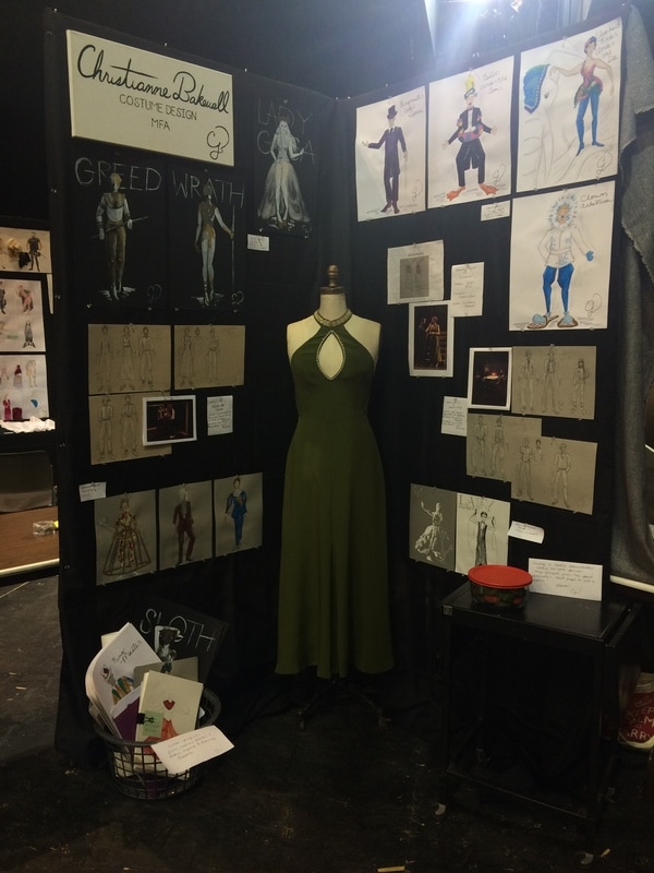
May marks the beginning of finals, graduation parties, and for most arts students, portfolio reviews/shows. Over the past three years I have picked up a few tips and tricks for creating a cohesive and inviting display that I thought I would condense into five tips this month. I just finished my fifth portfolio review of my graduate career with one more this fall and "the big one" coming next January. Since it is the season we think of getting our work out there, here are five tips to helping you have a professional portfolio set up. 1. Keep your fonts in the same family When printing out your resume, business cards, notations for projects, name plate, etc. make sure your fonts have a dialogue together. For example if you take a look at my resume you will see my name and title sections are in the same family as the titles for my online portfolio. The body of my resume is a different font entirely, but the two fonts do not draw attention over each other. I like the look of a serif paired with a sans serif, but it is up to you. Font.com has a nice short article to help you pick which you like best. If you choose to mix your two fonts like I did, make sure you keep them organized. I like to make my serif font titles, headers, etc. while a sans serif is good for the body of a section. Don't feel like you need to mix fonts though. This entire blog is a serif and easily readable. Pro tip: NEVER use Comic Sans. Just don't. 2. Don't create a still life People have come to see your work and as you questions about your process. It becomes hard for them to do so if you lay out your work in a way that does not invite rummaging through your sketches or swatches. Organize your work in binders or hang up pieces that you want to be viewed a certain way. You can also lay out pieces loose leaf, but be prepared to have them move around your table a bit. I tend to put out little plaques that keep the table divided into sections without creating physical dividers. People want to look at your work. Let them. 3. Have a clean background for your work I use black fabric tablecloths to hang over my tables and board if it is not black already. This creates a clean surface for my designs to shine on top of. Those looking at my portfolio are not distracted by a crazy colorful background because the black does not compete with my designs. Sometimes a design in your background can work well if you have a well planned out theme and keep the color neutral. Color competes with your work. 4. Have an editor Have a trusted friend or colleague read through any of your written material before printing, mounting, etc. Apps such as Grammarly or Ginger (nybookeditors.com has a list here) can also be helpful before putting out your work for all to see. 5. Create a focal point of your display When setting up my portfolios I always try to create movement for the viewers. You tell stories with your design, try to tell a story with your display. For one portfolio I showed my design process for three characters of a recent play I designed that went through five or so redesigns. This was a really interesting way to present how I work to my audience. Another time I created a color collage with photos from the designed show and renderings. The color drew the eye first to the collage and then allowed the viewer to explore the rest of my display after quickly learning what it was about.
1 Comment
|
Topics
All
Archives
July 2021
|

