|
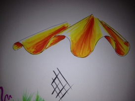
I have always enjoyed the feel of new art supplies. As a child I would anxiously await the start of another school year so I could frolic in the school supply aisle and ponder over whether I wanted the 48 count crayons or the 62 with the built in sharpener. I lived for that moment, which may also be a reason I enjoy costume design.  The other day I relived this sensation when finally purchasing my first package of Prismacolor(R) art markers*. While in undergrad our design classes only used colored pencils for renderings, so markers are a little foreign to me. I have used watercolor and watercolor pencils in the past for competition rendering (in high school), but that was as exotic as my abilities would get. I finally decided to splurge on myself (which you need to do from time to time) and get a respectable package of 24 art markers. Today I had some time, so I opened them up and took my new investment for a test draw (above). Now I must admit, this is nowhere near a great rendering, but I was playing and seeing how the colors and different sides (I got the brush style, which I really enjoyed using) of the markers interacted. My rendering might have looked a tad better if I had just stuck to the yellows and oranges. The red is just too much. Lesson learned: less is more. From what I have been told about the markers I am using, I know they are an alcohol, dye based ink. Apparently the best way to blend them is to saturate the paper and/or use one of their colorless blending markers. Since I bought a 24 pack, my set did not come with a blender. I did my best to blend colors, but having never worked with the medium before, you can be the judge of how well I did.
0 Comments
Leave a Reply. |
Topics
All
Archives
July 2021
|
